Now that Maximum Baby is crawling I wanted to get our huge tv off of the rickety cart it was sitting on. Sam had a tv fall on her as a child and one is enough for us.
The tricky thing here is that we wanted to mount the TV on a concrete pillar.
Trying to attach a flat thing to a curved thing is tricky. My solution was this:
- Got a 2×8 of Douglas Fir from my local Home Depot. They usually have crappy wood, but I managed to find a piece that looked quarter-sawn, so that’s good.
- Cut it to length based on the height of my TV, the height of my soundbar and allowing room for attaching some shelves later.
- At the base trim each side 45°, then angle the saw blade to 45 and make a cross cut. Makes a nice beveled end instead of a dramatic right angle.
- Use some of the scrap at the top to increase the depth so the TV mount screws get a lot of purchase depth. I used wood glue and 8 screws.
- Prime and paint.
- Attach hardware.
- For attaching it all to the pillar I decided to go with a friction mount. I ordered 3 endless loop ratchet straps and ratchet them tight against the pillar.
Using a friction mount is a dicey thing. Materials have two kinds of stickiness – or friction coefficients. One is how sticky two things are when they are at rest (static friction coefficient) and the other is how sticky two things are when they are moving (kinetic friction coefficient). Friction works great right up until you overcome the static friction coefficient and then it works very poorly because the kinetic friction coefficient is always lower than the static friction coefficient.
Good news is we can calculate how much force our friction mount should support! Friction is dependent on the pressure between two surfaces (the normal force) and the stickiness between them (the friction coefficient). The frictive force is going to be our normal force times the static friction coefficient.
How much normal force do we have? I’m estimating that I can ratchet around 150lbs of pressure on one of those ratchet straps. Let’s cut that a little bit because I haven’t been working out and I am an optimist. Let’s call it 120lbs. I’m using 3 ratchet straps so that adds up to 360lbs of pressure.
There’s a table on that page with friction coefficients for common materials. Looks like they say the static friction coefficient between wood and concrete is 0.62. 360lbs * 0.62 = 223.2lbs.
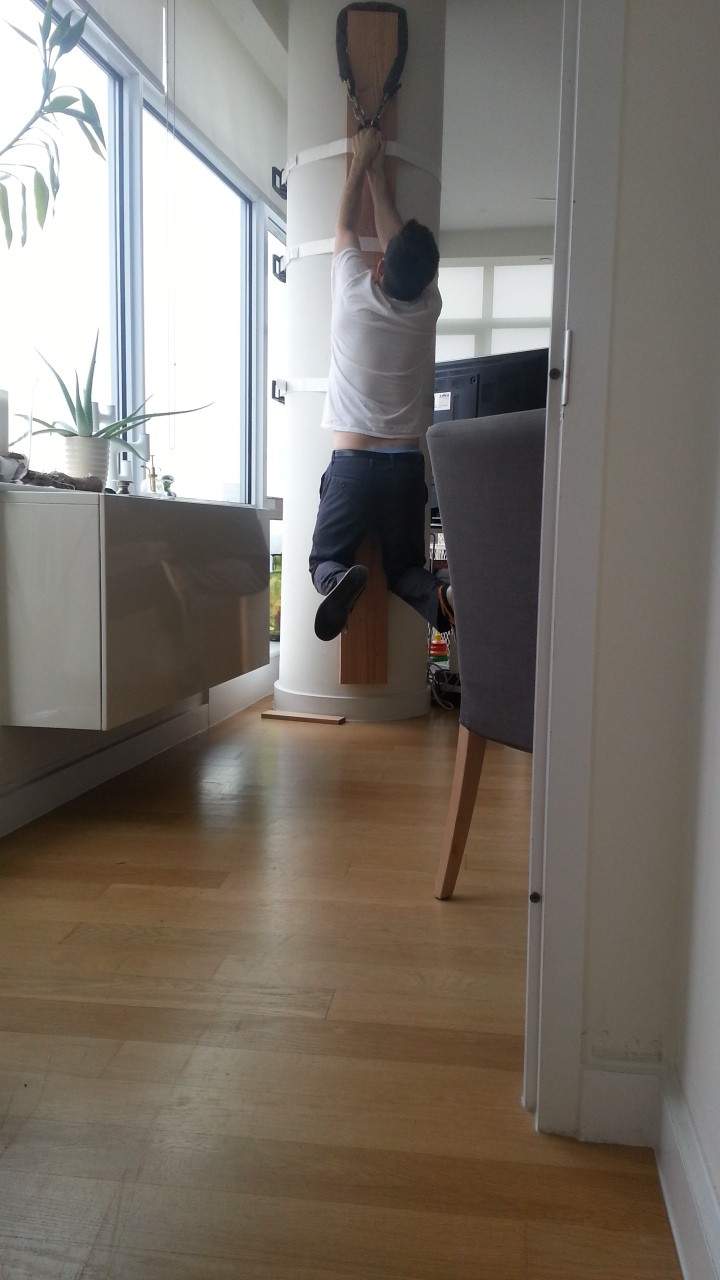
I’m around 175lbs – I should be able to do a pullup on this!
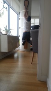
And I CAN!
My TV weighs 50.8 lbs, the tv mount weighs 8lbs, my shelves weigh 11lbs and they can support 22 lbs per shelf. I forget how much my soundbar weighs. Let’s call it 10 lbs.
50.8 + 8 + 11 + 22 + 22 + 10 = 123.8 lbs. I’ve got around 99 lbs of spare capacity before we hit the limit of my static coefficient of friction!
I feel like I can trust this not to drop on Max for a while! How long until Max might hang off of this and make it drop? Hmmm – when is he likely to be around 100lbs? Wolfram Alpha tells me a 10 year old American is around 94lbs. I should be able to teach him not to do it by then or get another ratchet strap.